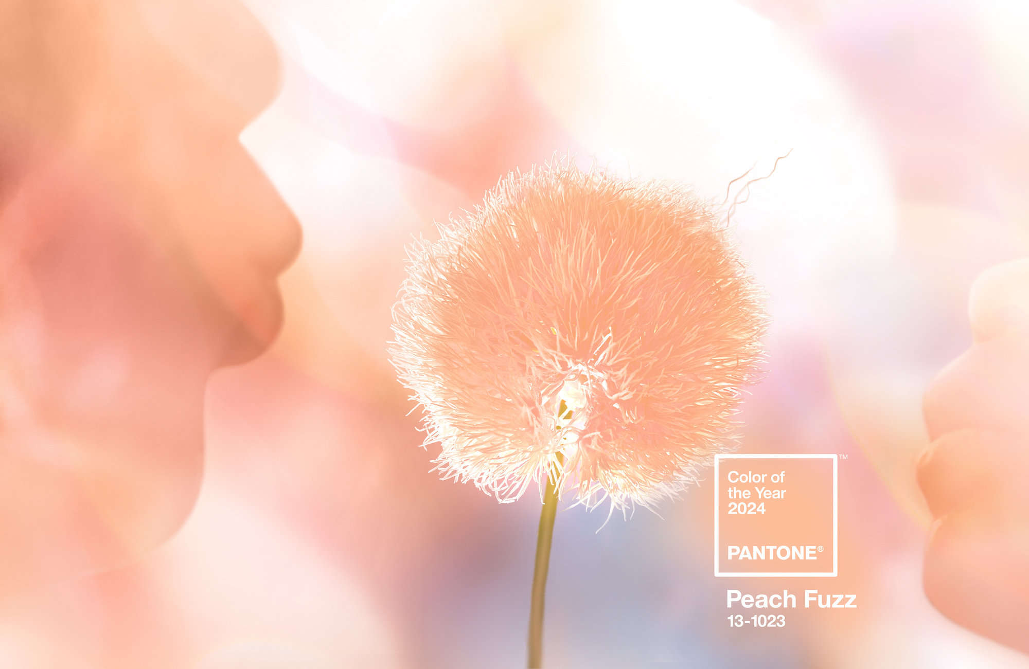
As a web designer, staying abreast of the latest design trends is crucial for creating visually appealing and contemporary websites. One key influencer in the world of design is Pantone, a renowned authority on colour. Each year, Pantone selects a Colour of the Year that sets the tone for design and aesthetics across various industries. In 2024, Peach Fuzz takes center stage, bringing warmth, sophistication, and a touch of nostalgia to the palette. In this article, we’ll explore the brief history of Pantone’s Colour of the Year, discuss how small businesses can seamlessly incorporate Peach Fuzz into their marketing and branding strategies, and five Peach Fuzz colour palettes to inspire your design.
The Evolution of Pantone’s Colour of the Year
Pantone’s Colour of the Year has become an anticipated announcement in the design world, shaping trends across fashion, interior design, graphic design, and more. The tradition began in the year 2000, with Cerulean Blue being the inaugural colour (the Cerulean blue sweater monologue from The Devil Wears Prada, brilliantly delivered by Meryl Streep, perfectly encapsulates the power of colour in fashion). Since then, Pantone’s expert color analysts meticulously choose a hue that reflects the current global zeitgeist and influences design decisions across various industries.
The selection process involves analysing trends in art, fashion, technology, and even socio-political factors. The chosen colour is intended to capture the collective mood and aspirations of society for the upcoming year. This annual revelation sparks creativity, drives innovation, and provides a shared language for designers worldwide.
Why It’s Important for Business to Understand the Colour of the Year?
Understanding and incorporating Pantone’s Colour of the Year into business strategies is more than just a design choice—it’s a reflection of cultural awareness and adaptability. Whilst, incorporating the colour into branding and marketing efforts helps businesses connect with their audience on a deeper level, it is impossible, and frankly, not wise, to change up your brand colours every year according to Pantone.
Despite that, I think there are perks for businesses to pay attention to Pantone’s Colour of the Year, because it showcases a brand’s ability to stay current and resonates with the evolving preferences of consumers. Consumers subconsciously associate colors with emotions and experiences. Peach Fuzz, with its warm and gentle tones, conveys a sense of comfort, optimism, and approachability.
In fact, according to Pantone’s website:
Subtly sensual, PANTONE 13-1023 Peach Fuzz is a heartfelt peach hue bringing a feeling of kindness and tenderness, communicating a message of caring and sharing, community and collaboration. A warm and cozy shade highlighting our desire for togetherness with others or for enjoying a moment of stillness and the feeling of sanctuary this creates, PANTONE 13-1023 Peach Fuzz presents a fresh approach to a new softness. An appealing peach hue softly nestled between pink and orange, PANTONE 13-1023 Peach Fuzz inspires belonging, recalibration, and an opportunity for nurturing, conjuring up an air of calm, offering us a space to be, feel, and heal and to flourish from.
A departure from bolder colours from years past, 2024’s Colour of the Year is about warmth, softness, tenderness, community and collaboration, in a time of turmoil and uncertainty. Whilst it may not be practical to start throwing the colour in your brand suite, businesses can harness the message behind the colour: collective aspirations for community and connection, and use that in your marketing initiatives to enhance your brand perception.
How Small Businesses Can Incorporate the Annual Colour?
If you’re in the process of branding your business or looking to incorporate the colour in a literal sense, here are some ways to achieve that:
- Logo and Branding: Update your logo or elements of your branding to include accents or complementary shades of Peach Fuzz. This subtle change can infuse a fresh and modern feel without a complete brand overhaul.
- Website Design: Integrate Peach Fuzz into your website’s colour scheme. This can be applied to background elements, buttons, or text highlights. The colour should be used strategically to create an inviting and harmonious visual experience for visitors.
- Marketing Collateral: From business cards to brochures, incorporate Peach Fuzz into your print materials. This consistency across various touchpoints reinforces brand identity and makes your business instantly recognisable. What I love about Peach Fuzz is the ability to translate the colour as rose gold foil on print, creating an instant up-market look, yet still retain a sense of warmth.
- Social Media Graphics: Create eye-catching social media graphics that utilise Peach Fuzz. This can include post images, banners, and promotional material. Consistent use of the color helps establish a cohesive online presence.
- Product Packaging: If applicable, update product packaging or labels with Peach Fuzz accents. This not only aligns your products with current design trends but also enhances shelf appeal.
Five Stunning Colour Palettes for Peach Fuzz
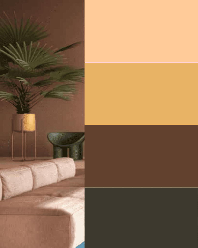
I’m inspired by Peach Fuzz, specifically because it is Sincere Copy’s brand colours. So, I’ve compiled five colour palettes that work well with peachy tones to inspire your marketing and branding. I hope you enjoy them!
Peaches and Cream: evocative, alluring and innocent
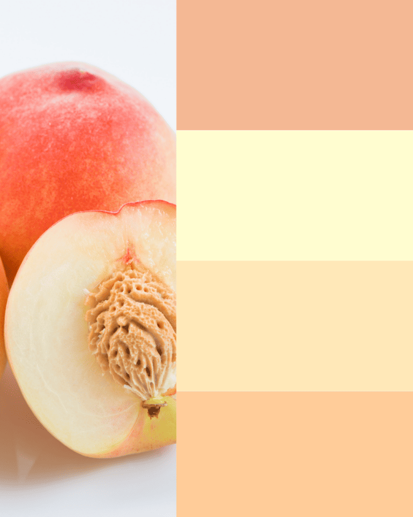
Summer Dreaming: Shimmering, elegant, lush

Nostalgia Summer: Sentimental, warm, muted
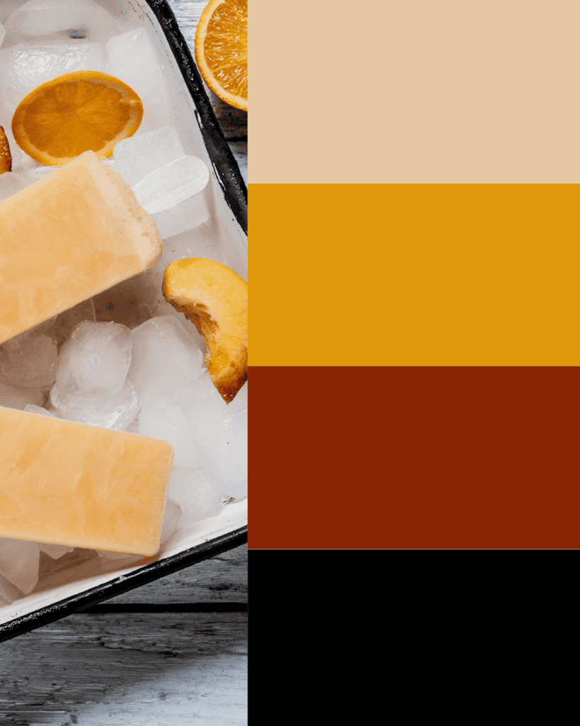
Blossoms in Skies: Tranquil, elegant, decliate
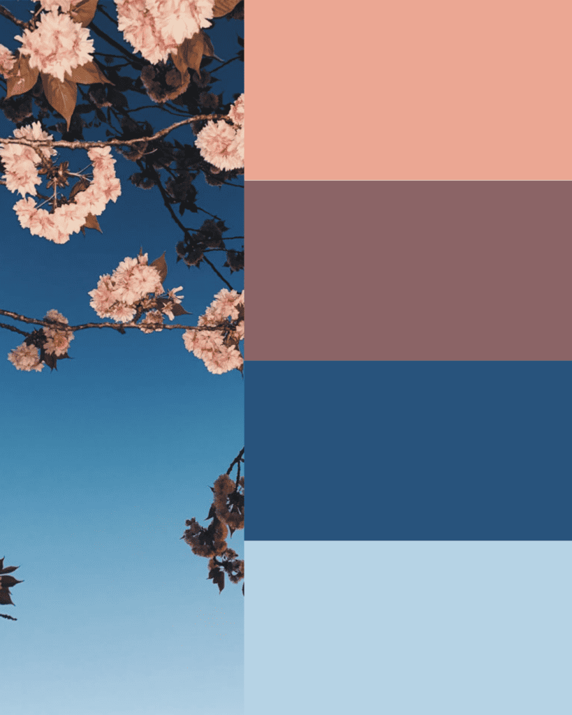
Retro Glam: Cozy, nostalgia, nature
In the ever-changing landscape of design, Pantone’s Color of the Year serves as a pointer to society’s collective aspiration, influencing aesthetics and setting the stage for creative exploration. For small businesses, considering or embracing Colour of the Year and the colour’s sentiments in their branding and marketing endeavours is an opportunity to connect with customers on a deeper level and stand out in a competitive market.
What do you think of the colour palettes? Contact me to share your thoughts, feedback or comments.
